Nice. I can see the 'C' shape now. After looking at the articles about negative space, you might check out how that pose looks in silhouette. I am going to do the same thing on mine and see how things look.
I've actually been doing that almost since the beginning....and without the props, I must admit, I'm not exactly feeling it as much when I black it out now. :(
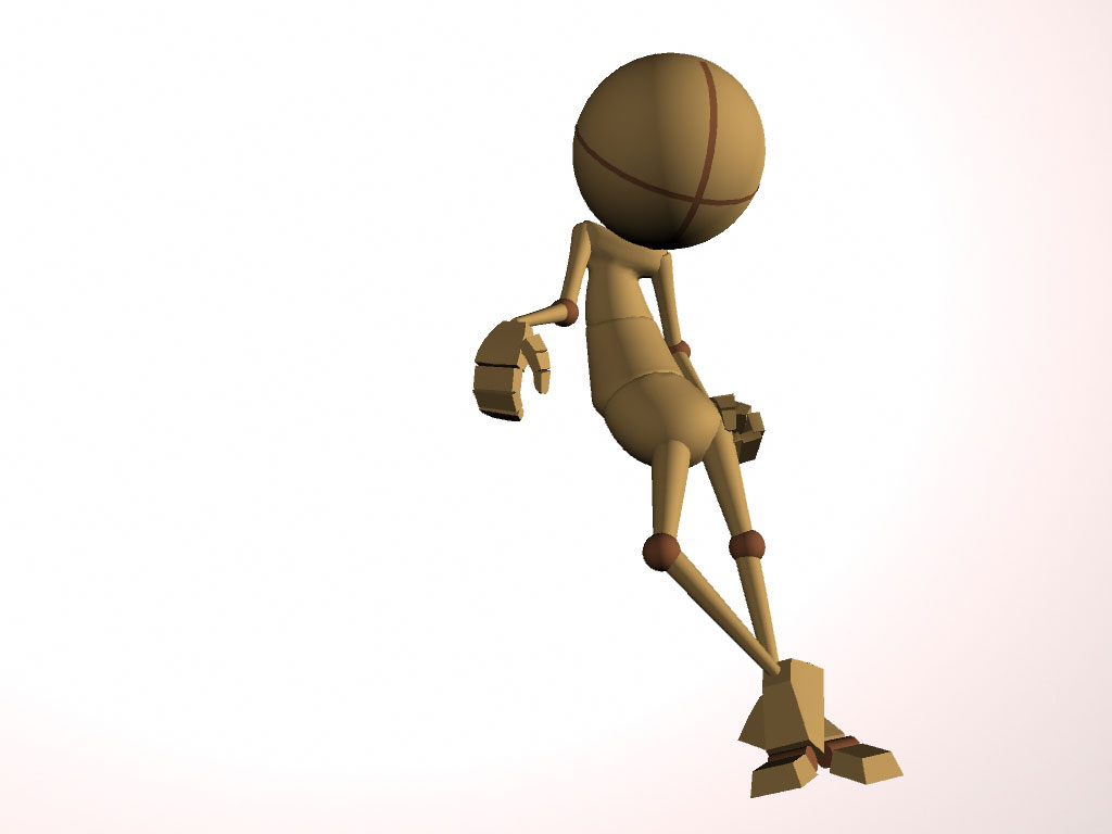
I liked the negative space between his left arm/side better when his elbow was point out more, but to get the "worn out" vibe it just wouldn't work.
Still have some time to play though, so I'll keep at it.

Nice. I can see the 'C' shape now. After looking at the articles about negative space, you might check out how that pose looks in silhouette. I am going to do the same thing on mine and see how things look.
ReplyDeleteI've actually been doing that almost since the beginning....and without the props, I must admit, I'm not exactly feeling it as much when I black it out now. :(
ReplyDeleteI liked the negative space between his left arm/side better when his elbow was point out more, but to get the "worn out" vibe it just wouldn't work.
Still have some time to play though, so I'll keep at it.